The Future of Responsive Web Design: Technologies & Trends You Should Know
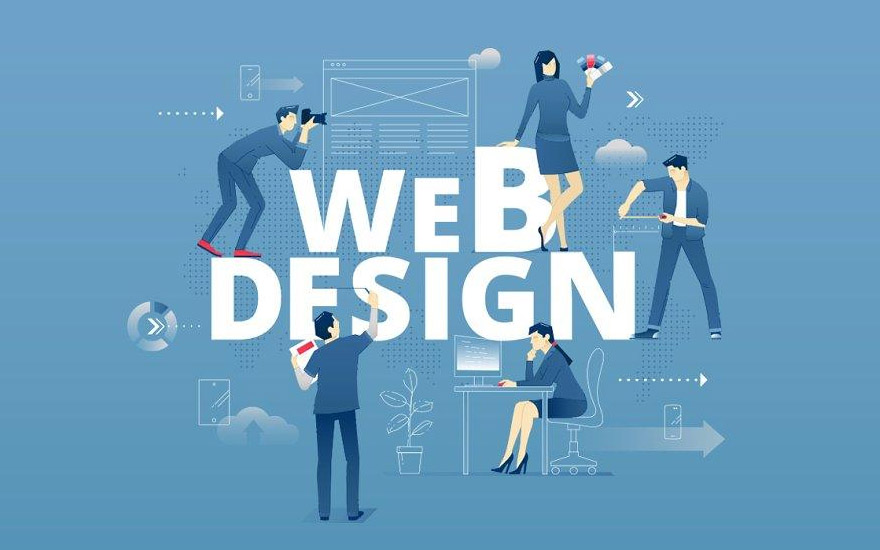
Introduction: Why Responsive Web Design Matters
In today’s digital era, users engage with websites across phones, tablets, and desktops—making responsive web design (RWD) more essential than ever. Responsive Web Design ensures seamless user experience regardless of device or screen size. At Inspiro Edutech, a government-approved training institute in Trivandrum, Neyyattinkara, Attingal, and Kazhakoottam, we help learners master the core technologies and trends that define modern responsive design.
Core Technologies Behind Responsive Web Design
1. Fluid Grids
Fluid grids use relative units like percentages instead of fixed pixels. This allows web layouts to adapt smoothly to different screen sizes. Popular CSS frameworks like Bootstrap and Foundation simplify fluid grid implementation.
2. Flexible Images
Responsive images scale automatically using the max-width: 100% rule in CSS. This ensures images stay proportionate and fit within any container on all devices.
3. Media Queries
Media queries are essential for tailoring CSS styles to specific screen dimensions and orientations. They enable designers to craft mobile, tablet, and desktop-friendly layouts.
4. Viewport Meta Tag
This tag controls how a page is displayed on mobile browsers. Setting the correct viewport ensures that the layout scales appropriately, delivering a consistent experience across devices.
5. CSS Flexbox & Grid Layout
These layout models offer robust flexibility in arranging elements, replacing older float-based methods. They simplify the creation of complex, responsive designs.
6. CSS Preprocessors
Languages like Sass and LESS streamline CSS by offering variables, mixins, and nesting—enhancing the organization and efficiency of responsive stylesheets.
7. Mobile-First Approach
Designing for smaller screens first and then scaling up ensures optimal usability. This strategy prioritizes content and performance across all devices.
Latest Trends Shaping Responsive Web Design
1. Dark Mode Support
Dark mode is increasingly adopted for its aesthetic appeal and battery-saving benefits. Integrating dark themes into your design enhances accessibility and user comfort.
2. Accelerated Mobile Pages (AMP)
AMP optimizes page loading speed on mobile devices. This Google-backed initiative improves performance, user engagement, and even SEO rankings.
3. WebAssembly (Wasm)
Though not exclusive to RWD, WebAssembly enables fast, browser-based execution of code written in languages like C++ or Rust, improving complex app performance on all devices.
4. Responsive Typography
Typography now adapts to device size using variable fonts and dynamic scaling. This trend ensures optimal readability and brand consistency.
5. Voice User Interface (VUI)
Voice navigation is gaining popularity with the rise of smart assistants. VUI integration allows users to interact with websites using voice commands, improving accessibility.
6. Motion UI
Animations and transitions boost user engagement. When used smartly, they guide user attention and enhance mobile interactions without slowing performance.
7. Progressive Web Apps (PWA)
PWAs combine the best of websites and mobile apps. They load fast, work offline, and deliver a consistent user experience on all devices
Conclusion
Responsive Web Design in Trivandrum is evolving rapidly—driven by flexible grids, adaptive layouts, and cutting-edge trends. At Inspiro Edutech, we prepare you for the future of web development with hands-on training and government-approved certification. Whether you’re in Trivandrum, Neyyattinkara, Attingal, or Kazhakoottam, start your journey into responsive design today and shape digital experiences that work beautifully on every screen.


